


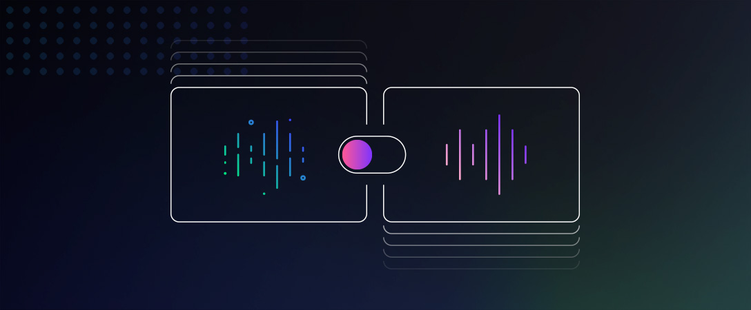
The Dolby.io Enhance API provides developers with a best-in-class solution for audio enhancement. With our Enhance API, you can improve the audio quality of any media file at an incredible scale; whether it is by removing background noise and hums, ensuring consistent loudness levels, or reducing mouth clicks. If you are already using this API in your application, this blog post will explain how to create a media comparison widget that shows your users the capabilities of our audio enhancement solutions. This blog post would also serve as a great beginner guide for anyone to learn how to create and utilize framework-agnostic web components using only standard HTML, CSS, and JavaScript.
The source code for the project detailed in this article is available on Github: https://github.com/dolbyio-samples/media-enhance-toggle-player-web-component/
What Are Web Components?
Frontend web frameworks like React and Vue.js have popularized the practice of building web applications using a component-based paradigm. This paradigm involves creating configurable and reusable UI components that can be used across different web applications. While the reusability feature of web components has been game-changing, components built with a certain framework are limited to applications also built in that framework. For example, web components built in React can’t be used in non-React web application.
Fortunately, HTML5 provides a set of web platform APIs that enable developers to build web components (also referred to as custom elements) in standard technologies (HTML, CSS, JavaScript) that can be used in any web application.
What We Are Building
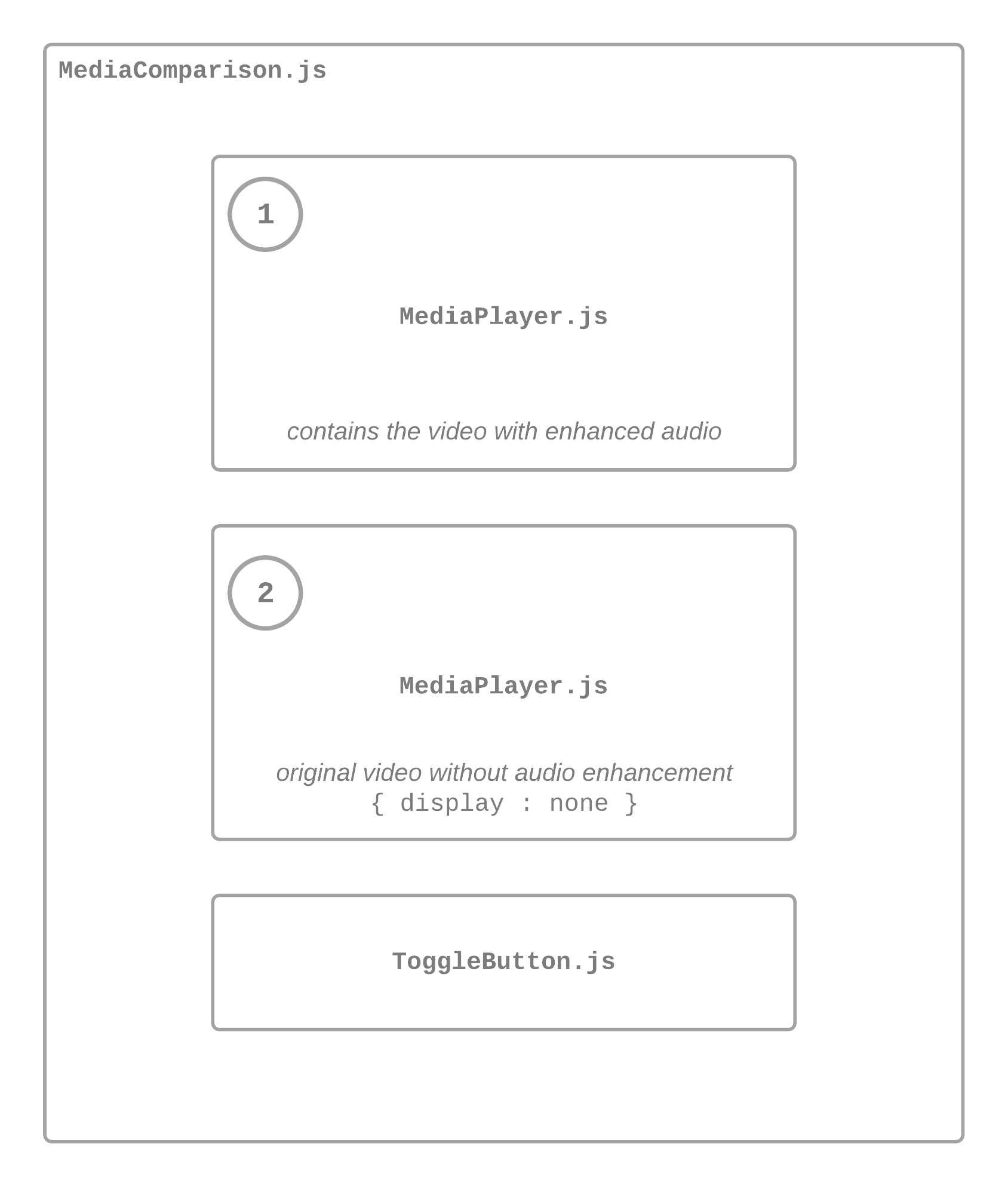
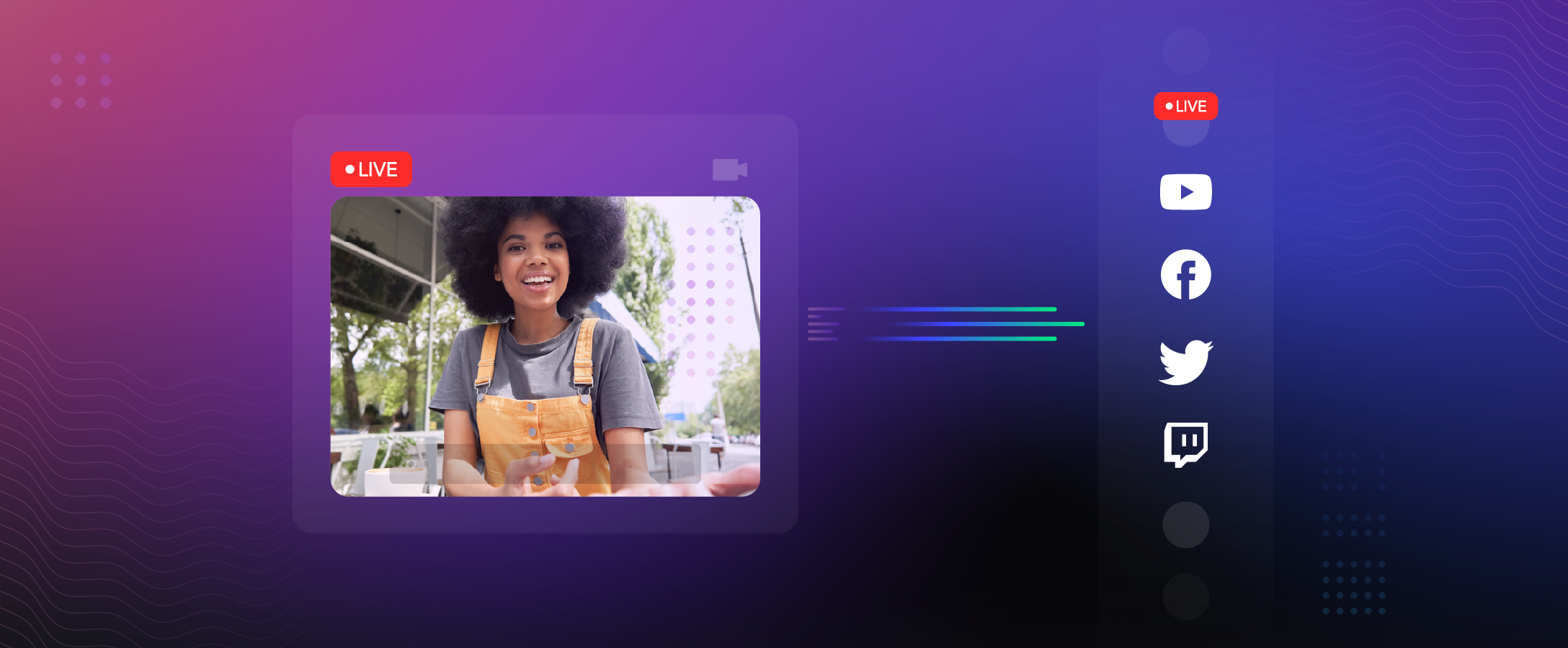
In this article, you will learn how to build a framework-agnostic before and after media comparison component. This web component would contain three custom sub-components: two media players and a toggle button.
The first media player would contain the video with enhanced audio. The second media player would be hidden and contain the original video without audio enhancement. Finally, the toggle button component would switch the audio (from original to enhanced) by simply muting and unmuting the appropriate video.
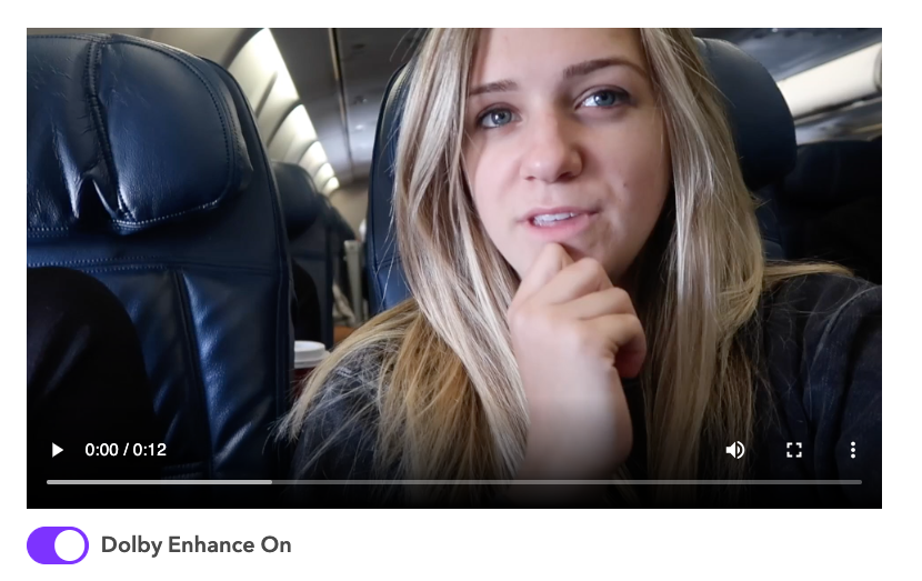
Here is what the final result would look like:
And here is what the folder structure for this project would look like:
.
├── assets/
│   ├── before.mp4
│   └── after.mp4
├── components/
│   ├── MediaComparison.js
│   ├── MediaPlayer.js
│   └── ToggleButton.js
└── index.html
MediaComparison.js would contain the definition for the main component that will connect the media player and the toggle button child components.
For your convenience, I have attached the media files that were used in the demo video above (before.mp4 and after.mp4). These video files should be added in the assets folder.
Setup HTML File
Now you have a basic understanding of the structure of this project, the first thing you want to do is create an index.html file and add this code to it to link the JavaScript file that contains the definitions for your custom elements. You can scroll to the “Add Custom Element to HTML File” section of this article to see how the MediaComparison custom element would be used in this HTML file.
<!DOCTYPE html>
<html>
  <head>
    <meta charset="utf-8">
    <meta name="viewport" content="width=device-width">
  </head>
  <body>

    <!-- todo: add MediaComparison custom element -->

    <!-- link to the javascript file for the custom elements -->
    <script src="./components/MediaPlayer.js" type="text/javascript"></script>
    <script src="./components/ToggleButton.js" type="text/javascript"></script>
    <script src="./components/MediaComparison.js" type="text/javascript"></script>
  </body>
</html>
Define the MediaPlayer Element
As previously stated, the MediaPlayer component will serve as the container for the media files. The code below defines the basic structure of this component.
class MediaPlayer extends HTMLElement {
    constructor() {
        super();

    }

    // creates a standard HTML video/audio element.
    createMedia() {  }
    // creates the CSS style rules for this component.
    createStyle() {  }
    // this function is called when this component is added to the DOM
    connectedCallback() {  }
}

customElements.define("media-player", MediaPlayer);
This class contains the implementation for the media-player custom element. Since the class extends HTMLElement, it will inherit all the standard properties and methods of a standard HTML elements such as class, id, setAttribute() etc. This inheritance is done using the super() method in the constructor.
The createMedia() method would be used to create a standard HTML video/audio element for this media component and the createStyle() method would create the CSS style that will apply to the component.
Next, connectedCallback() is invoked each time the MediaPlayer (media-player) element is loaded into the DOM. Finally, the last statements binds the tag name media-player to the MediaPlayer class so it can be used just as any other HTML tag.
Add Custom Properties and Attributes to the Element
After building the basic structure of the MediaPlayer class, you have to initialize the properties in the class constructor that will be used to create the appropriate media player element. These properties should then get reassigned in the connectedCallback() method to the values of the corresponding attributes passed into the element.
class MediaPlayer extends HTMLElement {
    constructor() {
        super();
        // is this media an audio file?
        this.isAudio = null;
        // is this media player for the enhanced (or "after") media?
        this.isAfter = null;
        // cover for media player
        this.poster = null;
        // media file directory
        this.mediaFile = null;
        // represents the media format
        this.mime = null;
    }

    // creates a standard HTML video/audio element.
    createMedia() { }
    // creates the CSS style rules for this component.
    createStyle() { }
    // this function is called when this component is added to the DOM
    connectedCallback() {
        this.isAudio = this.hasAttribute("isAudio");
        this.isAfter = this.hasAttribute("isAfter");
        this.poster = this.getAttribute("poster");
        this.mediaFile = this.getAttribute("mediaFile");
        this.mime = this.getAttribute("mime");
    }
}

customElements.define("media-player", MediaPlayer);
isAudio and isAfter are special kinds of attributes called boolean attributes. The value of a boolean attribute is true when it is present in an HTML element and false when it is absent.
Complete the Class Methods
The final step needed to complete this custom element is to build out its already defined methods. The createMedia() method simply creates a standard video or audio element based on the values of the MediaPlayer class properties. The created element is then set to the innerHTML property of the custom MediaPlayer element in the connectedCallback()method.
Similarly, the createStyle() method creates a standard HTML style element. This element is then appended to the MediaPlayer element to set its style.
class MediaPlayer extends HTMLElement {
    constructor() {
        super();
        // is this media an audio file?
        this.isAudio = null;
        // is this media player for the enhanced (or "after") media?
        this.isAfter = null;
        // cover for media player
        this.poster = null;
        // media file directory
        this.mediaFile = null;
        // represents the media format
        this.mime = null;
    }

    // creates a standard HTML video/audio element.
    createMedia() {
        let media = document.createElement(this.isAudio ? "audio" : "video");
        // set attributes for media element (<video> or <audio>)
        media.setAttribute("id", this.isAfter ? "after-media" : "before-media");
        media.setAttribute("poster", this.poster);
        // only show the "after" media
        media.style.display = this.isAfter ? 'block' : 'none';
        // only enable controls for "after" media
        if (this.isAfter) media.controls = true;

        let source = document.createElement("source");
        // set attributes for source element (<source></source>)
        source.setAttribute("id", this.isAfter ? "after-source" : "before-source");
        source.setAttribute("src", this.mediaFile);
        source.setAttribute("mime", this.mime || (this.isAudio ? "audio/mp3" : "video/mp4"));

        media.appendChild(source);

        // return serialized HTML element (i.e. HTML element as plain text)
        return media.outerHTML;
    }

    // creates the CSS style rules for this component.
    createStyle() {
        let style = document.createElement("style");
        // add style rules for the MediaPlayer element here
        style.innerHTML = ``;

        return style;
    }

    // this function is invoked when this component is added to the DOM
    connectedCallback() {
        this.isAudio = this.hasAttribute("isAudio");
        this.isAfter = this.hasAttribute("isAfter");
        this.poster = this.getAttribute("poster");
        this.mediaFile = this.getAttribute("mediaFile");
        this.mime = this.getAttribute("mime");

        // set the innerHTML for this custom element
        this.innerHTML = this.createMedia();
        // append style to this custom element
        this.appendChild(this.createStyle());
    }
}

customElements.define("media-player", MediaPlayer);
This is not the goal of this project but here is what the MediaPlayer element would look like if it were to be used independently in an HTML file:
<media-player poster="" mediaFile="" mime="" isAudio isAfter />Define the ToggleButton Element
The ToggleButton element will serve as the container for the toggle button. Its methods and properties will work similarly to the methods in the MediaPlayer class.
You can read this w3schools tutorial if you’d like to read more about how to create a toggle button in HTML and CSS.
class ToggleButton extends HTMLElement {
    constructor() {
        super();

        this.showAfter = null;
    }

    // creates a toggle button using standard HTML elements.
    createToggleButton() {
        let toggleContainer = document.createElement("label");
        toggleContainer.setAttribute("class", "toggle-container");

        let toggleButton = document.createElement("input");
        toggleButton.type = "checkbox";
        toggleButton.setAttribute("id", "toggle-button");
        // toggle on if the media player element shows "after" video first
        if (this.showAfter) toggleButton.setAttribute("checked", "");

        let toggleSlider = document.createElement("span");
        toggleSlider.setAttribute("class", "toggle-slider");

        let enhanceStatus = document.createElement("span");
        enhanceStatus.setAttribute("id", "enhance-status");
        enhanceStatus.innerHTML = this.showAfter ?
            "Dolby Enhance On" : "Dolby Enhance Off";

        toggleContainer.appendChild(toggleButton);
        toggleContainer.appendChild(toggleSlider);
        toggleContainer.appendChild(enhanceStatus);

        return toggleContainer.outerHTML;
    }

    // creates the CSS style rules for this custom element.
    createStyle() {
        let style = document.createElement("style");
        // add style rules for this custom element here
        style.innerHTML = ``

        return style;
    }

    // this function is invoked when this component is added to the DOM
    connectedCallback() {
        // set this.showAfter when the element has been added to DOM
        this.showAfter = this.hasAttribute("showAfter");

        // set the innerHTML for this custom element
        this.innerHTML = this.createToggleButton();
        // append style to this custom element
        this.appendChild(this.createStyle());
    }
}

customElements.define("toggle-button", ToggleButton);
Here is what the ToggleButton element would look like if it were to be used independently in an HTML file:
<toggle-button showAfter />Style the ToggleButton Element
This step is optional but if you want your toggle button to look the one in demo video you should add this style to the createStyle() method.
Note: . . . means some lines of code were omitted to keep the code samples concise.
class ToggleButton extends HTMLElement {
    constructor() {
        super();

        //... constructor properties
    }

    //... createToggleButton() method

    // creates the CSS style rules for this custom element.
    createStyle() {
        let style = document.createElement("style");
        // add style rules for this custom element here
        style.innerHTML = `
            .toggle-container {
                margin-top: 1em;
                position: relative;
                display: inline-block;
                width: 60px;
                height: 34px;
            }

            .toggle-container input {
                opacity: 0;
                width: 0;
                height: 0;
            }

            .toggle-slider {
                position: absolute;
                cursor: pointer;
                top: 0;
                left: 0;
                right: 0;
                bottom: 0;
                background-color: #ccc;
                -webkit-transition: .4s;
                transition: .4s;
            }

            .toggle-slider:before {
                position: absolute;
                content: "";
                height: 26px;
                width: 26px;
                left: 4px;
                bottom: 4px;
                background-color: white;
                -webkit-transition: .4s;
                transition: .4s;
            }

            input:checked + .toggle-slider {
                background-color: rgb(62, 68, 254);
            }

            input:focus + .toggle-slider {
                box-shadow: 0 0 1px rgb(62, 68, 254);
            }

            input:checked + .toggle-slider:before {
                -webkit-transform: translateX(26px);
                -ms-transform: translateX(26px);
                transform: translateX(26px);
            }

            .toggle-slider {
                border-radius: 34px;
            }

            .toggle-slider:before {
                border-radius: 50%;
            }

            #enhance-status {
                font-family: Avenir Next;
                margin-left: 60px;
                position: absolute;
                width: 200px;
                font-size: 18px;
                font-weight: 600;
                top: 50%;
                -ms-transform: translateY(-50%);
                transform: translateY(-50%);
            }
        `

        return style;
    }

    // this function is invoked when this component is added to the DOM
    connectedCallback() {
        // ... ommitted code for conciseness

        // append style to this custom element
        this.appendChild(this.createStyle());
    }
}

customElements.define("toggle-button", ToggleButton);
Define the MediaComparison Element
The MediaComparison element will serve as the parent element for the MediaPlayer and ToggleButton element. The code below defines the basic structure of this component.
class MediaComparison extends HTMLElement {
    constructor() {
        super();
        // attaches shadow DOM to current instance of this element
        this.attachShadow({
            'mode': 'open'
        });
    }

    // creates instance of the MediaPlayer custom element
    createMediaPlayer(isAfter) {}
    // creates instance of the ToggleButton custom element
    createToggleButton() {}
    // invoked when the video/audio is played
    playVideo() {}
    // invoked when the video/audio is paused
    pauseVideo() {}
    // invoked when the video/audio ends
    endVideo() {}
    // invoked when the toggle button is clicked
    toggleMedia() {}
    // creates the CSS style rules for this component
    createStyle() {}
    // invoked when this component is added to the DOM
    connectedCallback() {
        // create sub-components for this custom element
        let afterMediaPlayer = this.createMediaPlayer(true);
        let beforeMediaPlayer = this.createMediaPlayer(false);
        let toggleButton = this.createToggleButton();

        // assign HTML content that should be rendered by this custom element.
        this.shadowRoot.innerHTML = `
            ${afterMediaPlayer}
            ${beforeMediaPlayer}
            ${toggleButton}
        `
        // append style to the shadow root of this custom element
        this.shadowRoot.appendChild(this.createStyle());
    }
}

customElements.define('media-comparison', MediaComparison);
The createStyle() and connectedCallback() methods serves the same purpose described in Define the MediaPlayer Element*.* This class also contains methods that will be triggered when an event occurs. For example, the toggleMedia() method will triggered when the toggle button is clicked.
The createMediaPlayer() and createToggleButton()methods are invoked in connectedCallback() to create two instances of the MediaPlayer element and an instance of the ToggleButtonelement. The argument passed into the createMediaPlayer() method parameter (isAfter) will be used by the method to determine what media player instance it should generate (a “before” or an “after” media player). The order of the sub-components in this class is described in Figure 1.
At this point, I’m sure you’re wondering what this.attachShadow({ 'mode': 'open' }) does and why this.shadowRoot.innerHTML was used in this custom element instead of this.innerHTML like in the MediaPlayer and ToggleButton class. These two statements create a Shadow DOM for the MediaComparison component. this.attachShadow({ 'mode': 'open' }) attaches the Shadow DOM to the current instance of the custom element and the this.shadowRoot.innerHTML contains the HTML content that should be rendered by the custom element.
Brief Overview of the Shadow DOM
So, what is a Shadow DOM? An important pillar of web components is encapsulation. Encapsulation is the process of isolating the internal structure of your web components from the global DOM to avoid unwanted external interferences. For example, an unexpected behavior could occur if you assign an id to an element in your web component and this component is then used in a page that already has this id attribute. With the Shadow DOM you can attach a hidden separated DOM to your custom elements and this DOM is accessible only through the shadowRoot property of the custom element.
Why wasn’t the Shadow DOM used in the MediaPlayer and ToggleButton class? The Shadow DOM wasn’t used in these classes because they are the child components of the MediaComparison custom element. In addition, we would need to access the DOM for these sub-components to manipulate their elements in tandem. For example, the “before” media player should start playing as soon as the “after” media play button is clicked. Similarly, the toggle button needs to mute or unmute the “before” or “after” media player accordingly.
While the Shadow DOM wasn’t used in the MediaPlayer or ToggleButton custom element, their internal structure will still be hidden from the global DOM since they are only instantiated behind the Shadow DOM of the MediaComparison element.
Learn more about the DOM (Document Object Model) and Shadow DOM.
Add Custom Properties and Attributes to the Element
After building the basic structure of the MediaComparison class with the Shadow DOM, you have to initialize the properties in the class constructor that will be used to create the appropriate media player and toggle button components. These properties should then get reassigned to their corresponding attribute in connectedCallback() when the MediaComparison custom element has be loaded into the DOM.
class MediaComparison extends HTMLElement {
    constructor() {
        super();
        // the source for the "before" media file
        this.beforeSrc = null;
        // the source for the "after" media file
        this.afterSrc = null;
        // the media type: video or audio?
        this.mediaType = null;
        // when true, play the audio of the after/enhanced media first
        this.showAfter = null;
        // the cover for the media player
        this.poster = null;
        // represents the media format
        this.mime = null;
        // attaches shadow DOM to current instance of this element
        this.attachShadow({
            'mode': 'open'
        });
    }

    // creates instance of the MediaPlayer custom element
    createMediaPlayer(isAfter) {}
    // creates instance of the ToggleButton custom element
    createToggleButton() {}
    // invoked when the video/audio is played
    playVideo() {}
    // invoked when the video/audio is paused
    pauseVideo() {}
    // invoked when the video/audio ends
    endVideo() {}
    // invoked when the toggle button is clicked
    toggleMedia() {}
    // creates the CSS style rules for this component
    createStyle() {}
    // invoked when this component is added to the DOM
    connectedCallback() {
        /** assign class properties to their corresponding attribute value
        when this element has been loaded into the DOM **/
        this.beforeSrc = this.getAttribute("beforeSrc");
        this.afterSrc = this.getAttribute("afterSrc");
        this.mediaType = this.getAttribute("mediaType");
        this.showAfter = this.hasAttribute("showAfter");
        this.poster = this.getAttribute("poster");
        this.mime = this.getAttribute("mime");

        // create sub-components for this custom element
        let afterMediaPlayer = this.createMediaPlayer(true);
        let beforeMediaPlayer = this.createMediaPlayer(false);
        let toggleButton = this.createToggleButton();

        // assign HTML content that should be rendered by this custom element.
        this.shadowRoot.innerHTML = `
        ${afterMediaPlayer}
        ${beforeMediaPlayer}
        ${toggleButton}
    `
        // append style to the shadow root of this custom element
        this.shadowRoot.appendChild(this.createStyle());
    }
}

customElements.define('media-comparison', MediaComparison);
Complete the First Set of Class Methods
The first set of methods in the MediaComparison class are fairly self-explanatory. They define the how the MediaPlayer and ToggleButton element should be created based on certain properties. And as previously stated, the createStyle() method defines the style that should be applied to this custom element.
class MediaComparison extends HTMLElement {
    constructor() {
        super();
        // the source for the "before" media file
        this.beforeSrc = null;
        // the source for the "after" media file
        this.afterSrc = null;
        // the media type: video or audio?
        this.mediaType = null;
        // when true, play the audio of the after/enhanced media first
        this.showAfter = null;
        // the cover for the media player
        this.poster = null;
        // represents the media format
        this.mime = null;
        // attaches shadow DOM to current instance of this element
        this.attachShadow({
            'mode': 'open'
        });
    }

    // create instance of the MediaPlayer custom element
    createMediaPlayer(isAfter) {
        let mediaPlayer = document.createElement("media-player");
        // set attributes for this custom element
        mediaPlayer.setAttribute("poster", this.poster ?? "");
        mediaPlayer.setAttribute("mediaFile", isAfter ? this.afterSrc : this.beforeSrc);
        mediaPlayer.setAttribute("mime", this.mime ?? "");

        if (this.mediaType === "audio") mediaPlayer.setAttribute("isAudio", true);
        if (isAfter) mediaPlayer.setAttribute("isAfter", isAfter);

        // return serialized HTML element (i.e. HTML element as plain text)
        return mediaPlayer.outerHTML;
    }

    // creates instance of the ToggleButton custom element
    createToggleButton() {
        let toggleButton = document.createElement("toggle-button");
        // set attributes for this custom element
        if (this.showAfter) toggleButton.setAttribute("showAfter", "");

        // return serialized HTML element (i.e. HTML element as plain text)
        return toggleButton.outerHTML;
    }

    // creates the CSS style rules for this component
    createStyle() {
        let style = document.createElement("style");
        // add style for the mediaComparison component here
        style.innerHTML = ``;

        return style;
    }

    // invoked when the video/audio is played
    playVideo() {}
    // invoked when the video/audio is paused
    pauseVideo() {}
    // invoked when the video/audio ends
    endVideo() {}
    // invoked when the toggle button is clicked
    toggleMedia() {}

    // invoked when this component is added to the DOM
    connectedCallback() {
        /* assign class properties to their corresponding attribute value
        when this element has been loaded into the DOM */
        this.beforeSrc = this.getAttribute("beforeSrc");
        this.afterSrc = this.getAttribute("afterSrc");
        this.mediaType = this.getAttribute("mediaType");
        this.showAfter = this.hasAttribute("showAfter");
        this.poster = this.getAttribute("poster");
        this.mime = this.getAttribute("mime");

        // create sub-components for this custom element
        let afterMediaPlayer = this.createMediaPlayer(true);
        let beforeMediaPlayer = this.createMediaPlayer(false);
        let toggleButton = this.createToggleButton();

        // assign HTML content that should be rendered by this custom element.
        this.shadowRoot.innerHTML = `
        ${afterMediaPlayer}
        ${beforeMediaPlayer}
        ${toggleButton}
    `
        // append style to the shadow root of this custom element
        this.shadowRoot.appendChild(this.createStyle());
    }
}

customElements.define('media-comparison', MediaComparison);
Complete the Event Listener Methods
playVideo, pauseVideo, endVideo are methods that will be passed into the event listeners for elements in the MediaPlayer component and toggleMedia will be passed into the event listener for elements in ToggleButton.
class MediaComparison extends HTMLElement {
    constructor() {
        super();
        //... constructor initialization
    }

    //... method defintions for createMediaPlayer, createToggleButton, createStyle

    // invoked when the video/audio is played
    playVideo(subComponents) {
        if (subComponents.beforeSource.src && subComponents.afterSource.src) {
            // mute the appropriate media player
            subComponents.afterMedia.muted = !this.showAfter;
            subComponents.beforeMedia.muted = this.showAfter;
            // play both media at the same time
            subComponents.beforeMedia.play();
            subComponents.afterMedia.play();
        }
    }

    // invoked when the video/audio is paused
    pauseVideo(subComponents) {
        if (subComponents.beforeSource.src && subComponents.afterSource.src) {
            // pause both media at the same time
            subComponents.afterMedia.pause();
            subComponents.beforeMedia.pause();
        }
    }

    // invoked when the video/audio ends
    endVideo(subComponents) {
        // get the default value from custom element attribute
        this.showAfter = this.hasAttribute("showAfter");
        // reset the mute statuses to the original state
        subComponents.afterMedia.muted = !this.showAfter;
        subComponents.beforeMedia.muted = this.showAfter;
        // set the current time of both media to 0
        subComponents.beforeMedia.currentTime =
            subComponents.afterMedia.currentTime = 0;
        // reset the toggle button and enhance status to original state
        subComponents.toggleButton.checked = this.showAfter;
        subComponents.enhanceStatus.innerHTML =
            this.showAfter ? "Dolby Enhance On" : "Dolby Enhance Off";
    }

    // invoked when the toggle button is clicked
    toggleMedia(subComponents) {
        if (subComponents.afterSource.src && subComponents.beforeSource.src) {
            subComponents.afterMedia.muted = this.showAfter;
            subComponents.beforeMedia.muted = !this.showAfter;

            // negate this.showAfter property to emulate a toggle
            this.showAfter = !this.showAfter;
            subComponents.enhanceStatus.innerHTML =
                this.showAfter ? "Dolby Enhance On" : "Dolby Enhance Off";
        }
    }

    // invoked when this component is added to the DOM
    connectedCallback() {
        //... reassign constructor properties to corresponsind attribute values
        //... create sub-components and add to the shadow root of this custom element
        //... append style to the shadow root of this custom element

        // get sub-components from this custom element's shadow root
        let subComponents = {
            beforeMedia: this.shadowRoot.getElementById("before-media"),
            beforeSource: this.shadowRoot.getElementById("before-source"),
            afterMedia: this.shadowRoot.getElementById("after-media"),
            afterSource: this.shadowRoot.getElementById("after-source"),
            toggleButton: this.shadowRoot.getElementById("toggle-button"),
            enhanceStatus: this.shadowRoot.getElementById("enhance-status")
        };

        // add event listeners to elements in MediaPlayer and ToggleButton
        subComponents.toggleButton.addEventListener("click", () => {
            return this.toggleMedia(subComponents)
        });

        subComponents.afterMedia.addEventListener("play", () => {
            return this.playVideo(subComponents)
        });

        subComponents.afterMedia.addEventListener("pause", () => {
            return this.pauseVideo(subComponents)
        });

        subComponents.afterMedia.addEventListener("ended", () => {
            return this.endVideo(subComponents)
        });
    }
}

customElements.define('media-comparison', MediaComparison);
The subComponents property accesses the object of elements in the MediaPlayer and ToggleButton class through the shadow root of the MediaComparison element. Event listeners are then added to these elements in the subsequent lines.
When the toggle button is clicked, it will play the audio of the currently muted media and mute the audio of the unmuted audio using the this.showAfter boolean value. The value of this boolean property is then negated and the status of the toggle button changes according (from “Dolby Enhance On” to “Dolby Enhance Off” or vice versa). This behavior is defined in toggleMedia().
When the play button of the “after” media (remember the after media player is the only visible media player) is clicked, it will mute or unmute the appropriate video and also trigger the play event in the “before” media. This behavior is defined in playVideo().
When the pause button of the “after” media is clicked, it will also trigger the pause event in the “before” media. The behavior defined in pauseVideo() and playVideo() will make both media play and pause at the same time.
Finally, when the media has reached its end, the status for the media players and the toggle button will be reset to their default values. The current time for both media will then be set to 0.
Add Custom Element to HTML File
The next thing you should do after creating the MediaComparison custom elements and its sub-components is to add this element to the index.html file you created earlier.
<!DOCTYPE html>
<html>
  <head>
    <meta charset="utf-8">
    <meta name="viewport" content="width=device-width">
  </head>
  <body>
    <!-- MediaComparison element for video media type -->
    <media-comparison
      beforeSrc = "./assets/videos/before.mp4"
      afterSrc = "./assets/videos/after.mp4"
      mediaType = "video" />

    <!-- link to the javascript file for the custom elements -->
    <script src="./components/MediaPlayer.js" type="text/javascript"></script>
    <script src="./components/ToggleButton.js" type="text/javascript"></script>
    <script src="./components/MediaComparison.js" type="text/javascript"></script>
  </body>
</html>
You are all done! If you followed all the steps correctly, the MediaComparison component should be working as expect on your HTML page.
How to Integrate with React
Using your web component in a React application requires minimal effort after you have created it with standard HTML, CSS, and JavaScript. All you need to do to get started is to wrap the code for the web component in a simple npm package, install the package, and then import the package wherever it’s required in your React application. For example, here is the npm package for the media comparison web component covered in this article: https://github.com/dolbyio-samples/media-enhance-toggle-player-web-component/tree/main/npm-component. If you’d like to test this component in a React application, you can start by following the steps below:
1. Clone the repository for this article and change directory to the web component npm package’s directory.
git clone https://github.com/dolbyio-samples/media-enhance-toggle-player-web-component && cd media-enhance-toggle-player-web-component/npm-component2. Create a symlink in your global node_modules folder.
npm linkThis creates an npm package on your machine called media-comparison-component. Note that package-name is taken from package.json, not from the directory name. You can read more about this here: https://docs.npmjs.com/cli/v8/commands/npm-link/.
3. Create a sample React application using create-react-app in your desired location.
npx create-react-app sample-app --use-npm4. Change directory to your sample app and link the media-comparison-component to the application.
npm link media-comparison-component5. Open src/App.js in your sample application and import the media-comparison-component.
import logo from './logo.svg';
import './App.css';

import 'media-comparison-component';

function App() {
  return (
    //... HTML code (omitted for conciseness)
  );
}

export default App;
6. Use your custom element in App.js.
Don’t forget to add your video assets to the ./public/ folder for this application and replace the value for beforeSrc and afterSrc below with the appropriate file directory.
import logo from './logo.svg';
import './App.css';

import 'media-comparison-component';

function App() {
  return (
    <media-comparison
        // make sure these files exist in your sample app's public folder
        beforeSrc="./assets/videos/before.mp4"
        afterSrc="./assets/videos/after.mp4"
        mediaType="video"
    ></media-comparison>
  );
}

export default App;
7. All done! You can now run your sample app in your browser by using the command below.
npm startHow to Integrate with Vue.js
Using your custom web component in Vue.js is just as effortless as integrating with React. Here are the steps you’ll need to take to achieve this:
1. Clone the repository for this article and change directory to the web component npm package’s directory.
git clone https://github.com/dolbyio-samples/media-enhance-toggle-player-web-component && cd media-enhance-toggle-player-web-component/npm-component2. Create a symlink in your global node_modules folder.
npm linkThis creates an npm package on your machine called media-comparison-component. Note that package-name is taken from package.json, not from the directory name. You can read more about this here: https://docs.npmjs.com/cli/v8/commands/npm-link/.
3. Install the Vue CLI if you don’t already have it installed.
npm install -g @vue/cli4. Create a sample Vue application using vue create in your desired location.
vue create sample-app --default5. Change directory to your Vue sample app and link the media-comparison-component to the application.
npm link media-comparison-component6. Replace src/main.js with the code sample below so that Vue doesn’t consider your custom HTML element as a Vue component.
import Vue from 'vue'
import App from './App.vue'

Vue.config.productionTip = false

// don't consider this custom element as a vue component
Vue.config.ignoredElements = [ 'media-comparison-component' ]

new Vue({
  render: h => h(App),
}).$mount('#app')
7. Open src/App.vue and import the media-comparison-component npm package in the <script> tag.
//... <template>

<script>
import HelloWorld from './components/HelloWorld.vue'
import 'media-comparison-component'

export default {
  name: 'App',
  components: {
    HelloWorld
  }
}
</script>

//... <style> tag
8. Use your custom element in the <template> tag in the same file (src/App.vue).
Don’t forget to add your video assets to the ./public/ folder for this application and replace the value for beforeSrc and afterSrc below with the appropriate file directory.
<template>
  <div id="app">
    <img alt="Vue logo" src="./assets/logo.png">
    <HelloWorld msg="Welcome to Your Vue.js App"/>
    <media-comparison
        beforeSrc="./assets/videos/before.mp4"
        afterSrc="./assets/videos/after.mp4"
        mediaType="video"
      ></media-comparison>
  </div>
</template>

//... <script>

//... <style>
9. All done! You can now run your sample app in your browser by using the command below.
npm run serve


")